


Google is introducing a new logo today, just a month after announcing a major company restructuring. The updated logo retains its wordmark style but features a modern sans-serif typeface, giving it a more playful look. The colors are now softer, aligning it closer to the design of its parent company, Alphabet, which also uses a simple wordmark.
ICYMT: U.S. bolsters Ghana’s security arsenal with $6M armoured vehicles donation
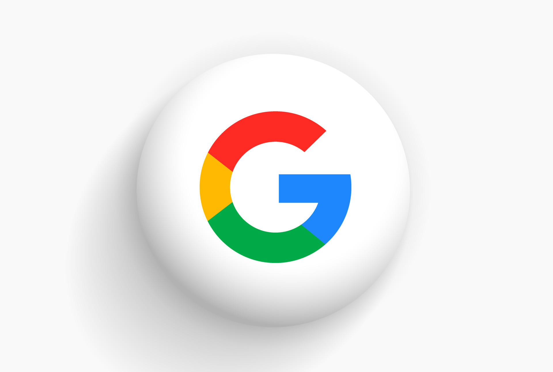
As noted in Google’s video introduction, the wordmark has evolved since its creation in 1998, but this is the most significant change since 1999, when the four-color logo was established. Today’s update includes an uppercase “G” logo for browser tabs, striped with all four colors. The new design will roll out across all Google products soon, already appearing on the homepage with an animation that transitions from the old logo to the new.
Google explains that the redesign reflects the changing technology landscape, emphasizing that Google is no longer just a desktop site but a wide range of apps and services accessible on various devices. The new logo aims to look good on smaller screens, with simpler lettering for better readability. It also features a lightweight version optimized for low-bandwidth connections, a crucial factor for expanding internet access globally.
The new “G” logo is already being seen across Google services, including a streamlined version for Google+.
SOURCE: THE VERGE


